CashGate – Micro Moments and Smart UX
Complex sales processes on the mobile – successfully solved!
Micro Moments and Smart UX as Conversion Booster in Mobile Commerce
Is it possible to sell complex financial products successfully on the mobile? And how should forms requiring a lot of input be constructed so that users are not deterred from completing them? Within the scope of the project “Mobile Sales Excellence”, initiated by the department “Sales Digital Channels” of the Aduno Group, we could work on these kinds of questions. The result of the concluding market test: persuasive mobile sales data.
The aim of the project consisted in the creation of fully completed forms for personal loans and credit cards directly on the mobile. This should be achieved by optimizing the mobile applications of cashgate and Viseca whereas hardly any constraints in terms of design were given.
The challenge: Both personal loans and credit cards require extensive data regarding personal details, employer and income information etc. as well as accompanying documents that have to be submitted.
How should such complex and lengthy application processes be constructed on the small, fast-living and partly impatient mobile device?
Our approach: Focussing consistently on real mobile user needs
In addition to experiments and inquiry of real users, the concentration on actual customer needs succeeded thanks to Google’s concept of the Micro Moments. The latter addresses the WHEN, HOW and WHY consumers turn to their mobile. Providing relevant content in these decisive moments results in an increase of the user’s interest and consideration for the brand. This again raises the probability of conversion. The Micro Moments for personal loans and credit cards significantly impacted the creation of each website.
Outcome: Innovative and unique solutions for complex products
Combining the mobile-first idea with user-oriented content generated individual mobile solutions.

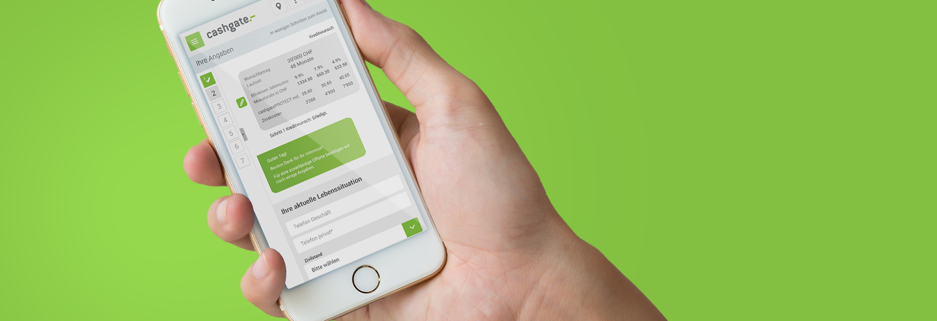
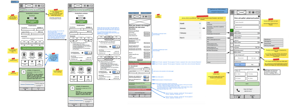
On the one hand, this comprises information- and need-driven front pages which leave no doubt in mobile usability and satisfy the need for information with featured sub-pages. On the other hand, this involves a form based on popular chat systems as solution for complex application processes. Contrary to the trend of reducing, the previous four unequally long steps of the form have been fragmented into seven small, manageable steps. These can be quickly worked off and their order can be autonomously selected by the user himself. This is done via the sidebar which also informs the user about his progress at all times.
Entering the form, clients are welcomed with chat bubbles – similar to what they are used to from their messenger apps. They are addressed with an explanation of which information is being asked and why it is needed. Moreover, users can check their previously given details in the familiar “chat history” at all times and are able to edit them via the pencil, known as edit-icon. In the lower part of the screen, the “actual” form is expanded in which the client is asked to provide his details.
In the context of the input, extra focus was put again on usability so that all fields, buttons, selections and functions meet current mobile best practices.
Both solutions were put under a market performance test in which all AdWords traffic was directed to the websites. In each testing period a remarkable and significant increase of conversion rates of about 55% on the mobile could be attained for both products.
For us, it is therefore confirmed that mobile users are indeed willing to complete complex application processes on their mobile device. Precondition – and simultaneously key to success – is a smart UX combined with consistent focus on mobile users needs.


